
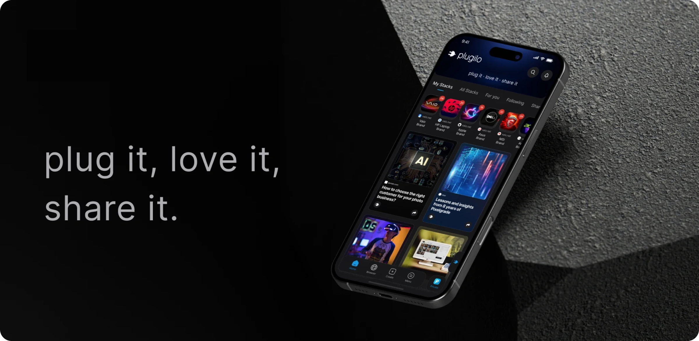
plugilo is not designed as a classic bookmark app. The Mobile App and the Web Portal are meant to live in users’ minds as a daily discovery feed, a trusted knowledge hub, an object-centered communication space, and a universal wishlist. Saving matters — but it is not the only purpose. The real value begins when scattered products, articles, ideas, trips, projects, and knowledge become clear Cards and useful Stacks.
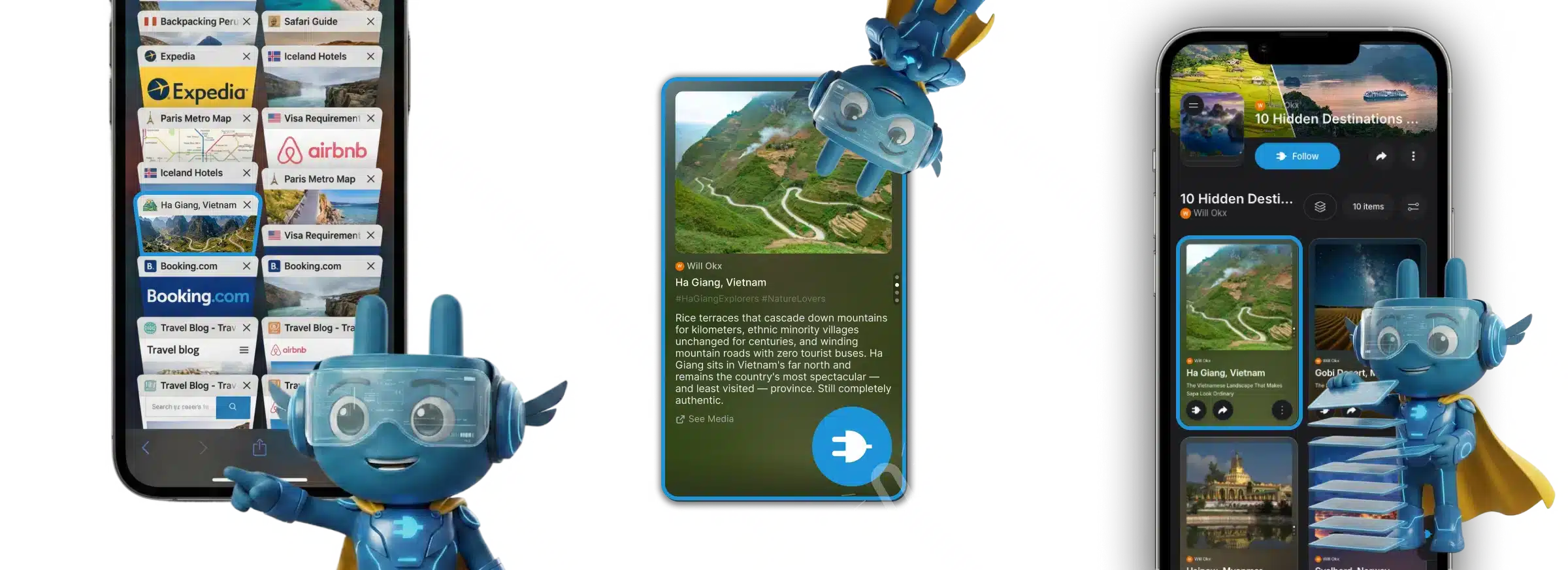
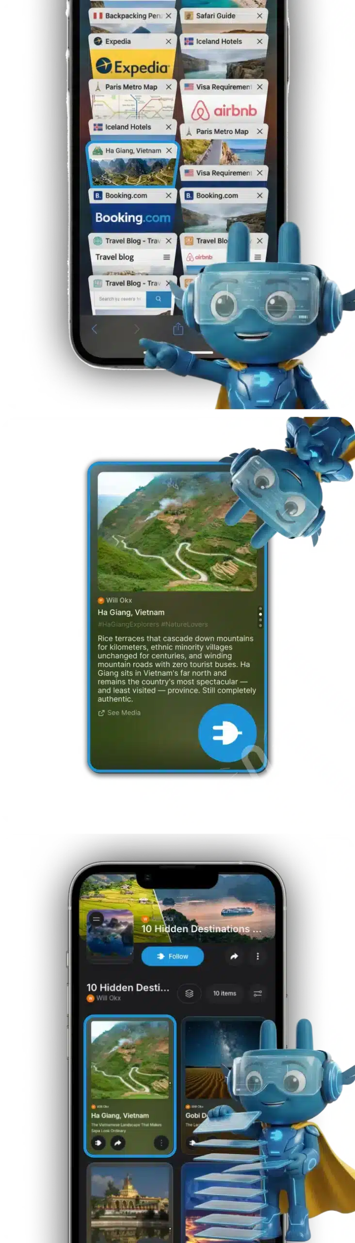
At the heart of the product are Cards and Stacks. Cards turn content into clear, structured objects. Stacks organize those objects into collections, comparisons, projects, wishlists, and thematic worlds. This transforms link chaos, screenshot collections, and tab overload into an interface that feels calm, understandable, and immediately useful.
That is why plugilo is more than an app interface. It is a system that compresses, organizes, and transforms content into a format that is easier to save, easier to find again, easier to share, and easier to discuss.
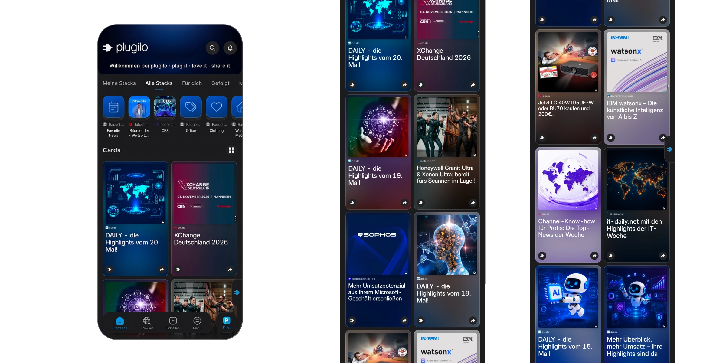
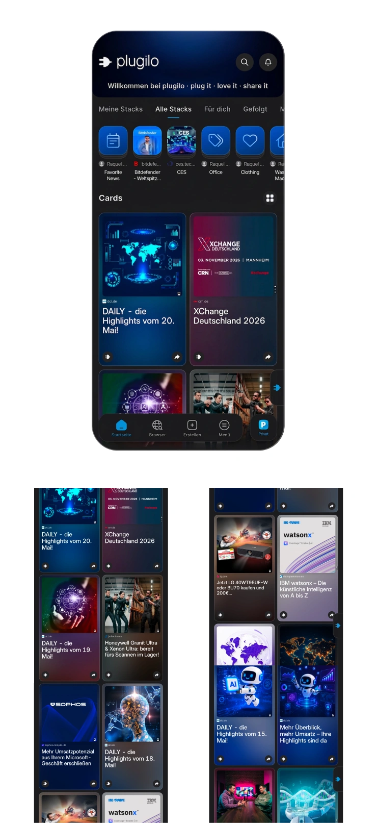
The plugilo Mobile App is not designed as a static storage space. Users should open it every day to discover something new, stay informed, see activity from friends, partners, brands, and experts, and follow relevant thematic worlds. The Web Portal extends that same experience into desktop, browser, and work contexts.
This creates something more than a simple saving app: a living but calm feed — with more relevance, more structure, and far less social media noise.
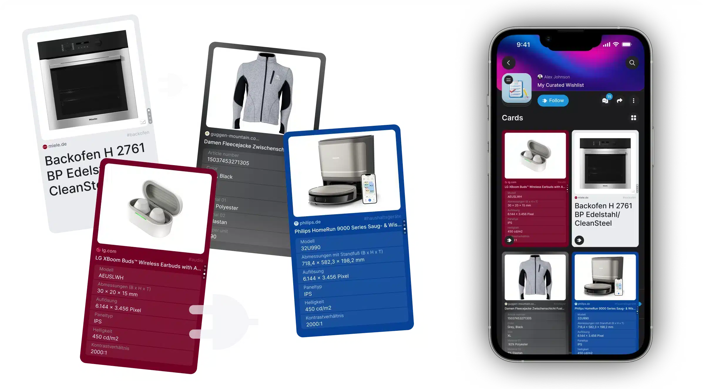
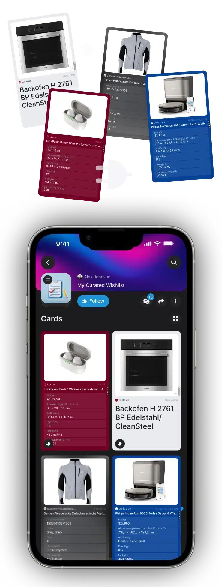
plugilo is designed as a universal wishlist across shops, websites, and sources. Content is not saved as raw links, but as Cards with structure, context, and recognizable meaning. This keeps information understandable, comparable, and easy to find again later — even when it originally came from completely different sources.
That makes plugilo stronger than classic wishlists, browser bookmarks, or screenshot collections. It is not only about finding something later. It is about turning digital things into a form that makes sense immediately.
The UX DNA of plugilo is clear: fast, consistent, and identical everywhere. The Mobile App and the Web Portal follow the same interaction logic so real muscle memory can develop. Two modes are central: click mode for classic use and swiping mode for ultra-fast organization. Swipe down places a Card directly into the most recently used Stack. Swipe up starts sharing, notes, or, in the future, assignment to an AI agent.
The experience should not feel like administration.
It should feel like natural flow. Less friction. Fewer clicks. More speed.
Stacks are the most important navigation unit in the app. This is not only where things are stored. It is where things are grouped, shared, discussed, passed on, and eventually advised on. A Stack should feel like a pile of cards in your hand — not like a rigid list. That is exactly why playful modes such as swiping, reordering, table logic, or the one-pager with arrow navigation are all part of the same product idea.
The result is an interface where organization does not feel like work.
It feels like clarity.
One of the strongest ideas of the plugilo Mobile App is object-centered communication. Conversations should not only happen between people, but directly around products, ideas, trips, decisions, Cards, and Stacks. Stack Conversations make exactly that possible: exchange like in a messenger — but tied to the actual context.
This makes discussions more focused, more understandable, and more useful. Instead of link spam, scattered screenshots, and chaotic group chats, a clear space emerges for shared decisions, recommendations, expert knowledge, and AI support.
plugilo is meant to be social without behaving like a traditional social network. No ad overload. No profile noise as the core. No public thread chaos. No irrelevant algorithm flood as identity. Instead: micro-networks made up of friends, partners, experts, brands, and relevant sources.
That makes the Mobile App and the Web Portal a calm, structured alternative to overloaded platforms — with discovery, but without constant distraction.
plugilo is designed AI-first. AI should compress, structure, tag, sort, visualize, personalize discovery, and assist with advisory directly at the object. At the same time, the interface stays clear: users should not feel like they are dealing with uncontrolled AI inside an abstract system, but with Cards and Stacks that are understandable, trustworthy, and immediately useful.
This creates a second brain on autopilot: less search stress, less manual organization, more clarity working quietly in the background.
The Mobile App is not only a frontend, but a visible access point to the larger plugilo trust architecture. Certified Cards, owner data, Master Data, Source Containers, and AI Advisory make the app a place where information can not only be found, but understood with origin and trust signals.
That is a major difference from classic consumer apps: plugilo combines everyday use with an infrastructure for reliable data.
plugilo does not end in the browser. The Mobile App is part of a system of app, Web Portal, plug/Stecker logic, widgets, partner pages, shop integrations, and physical touchpoints such as QR, NFC, or EAN scan. This allows the same product logic to extend from the web through the shop all the way to the POS/POI.
The best case is clear: scan or plug → Card opens → specs, FAQ, support, advisory, and next steps are instantly available. That is how the app becomes a bridge between digital and physical decision moments.
The plugilo Mobile App is not meant only for private use. The same logic also works for business contexts: organizing products, sharing shortlists, structuring knowledge, discovering brand content, using certified information, advising customers, or discussing projects as a team. The Web Portal especially extends this use into desktop, overview, admin, and browser-based workflows.
This turns plugilo into an interface that feels light in everyday use — while remaining professional enough to support serious information and decision processes.
One of the central product laws is performance. The app should feel lightning fast — more like Facebook or Gmail than a slow organization tool. Speed is not a side aspect, but part of the identity. Because only when the interface responds instantly does order stop feeling like effort.
That is why plugilo as a product is built around clarity, consistency, and one click less. Less friction. More flow. More return usage.
The strategic direction is clear: mobile-first. The Web Portal carries the same core functions and the same interaction logic so users can work with the same structure in both worlds. There can be differences in the specific surface — but not in the product logic.
That is exactly what makes plugilo strong over time: not a patchwork of different interfaces, but one continuous system of Cards, Stacks, Discovery, Sharing, Discussion, Trust, and AI.
The plugilo Mobile App and Web Portal turn products, articles, ideas, trips, knowledge, and decisions into clear Cards inside Stacks. They combine discovery, order, exchange, trust, and AI in one interface that can be useful every day — calm, fast, and without chaos.
What emerges is more than a better wishlist or a smarter bookmarking tool.
It is the daily interface for structured information use in the AI era.
See how plugilo structures, certifies, distributes, and makes information usable for AI.

Use certified data, trusted AI Advisory, and real intent signals to create more impact.
Become a Partner

Save, organize, compare, and share trusted Cards and curated Stacks.
Access plugilo portal: