

The internet is fragmented. Information is scattered, duplicated, and disconnected from its source. plugilo exists to fix that, by building the trusted information layer of the AI era.
These guidelines ensure that everything we create reflects that ambition: structured, reliable, and fun.
Visual Identity
Translating verified data into a clean, human-centric design language.
Logo System
The core signifiers of our identity: the plugilo wordmark. Engineered to sit cleanly as an overlay or anchor on any partner widget, ecosystem app, or physical bridge
Primary Logo



Monochrome Logos




The Blue-Grey Primary Logo is always favored on adaptive backgrounds (such as in email clients) to ensure optimal contrast across different devices and viewing modes.
Icon Variants




Critical Rule: Wordmark Never Appears Without the Icon
The "plugilo" typography must never be used in isolation. It is always paired with the brand icon to its left. The icon, however, may appear alone (as a favicon, app icon, watermark, or space-constrained UI element. This rule has no approved exceptions).
Meet pluggy
pluggy is plugilo's AI Advisory Agent, the living heart of plugilo's intelligence and the bridge between you and the trusted information you need. Smart enough to guide your decisions, warm enough to make the journey feel easy.



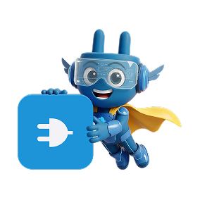
As the face of our intelligence, pluggy connects you to owner-approved insights at exactly the right moment, navigating complexity so you don't have to. Friendly, clear, and always on your side.
He is the constant reminder that behind every trusted answer, there's an intelligence that genuinely cares about getting it right, for you.
Color Palette
plugilo's color palette is built around a dark canvas that conveys depth and focus, anchored by our brand blue as a purposeful accent. Colors are not decorative, they carry meaning. Use them as defined to ensure consistency across product, marketing, and partner materials.


The dark base dominates the interface, giving content and data room to breathe without visual noise. Elevated surfaces layer above it to create structure, with cards, panels, and list rows that organize information without competing with it. Content tones range from near-white for primary text to softer greys for metadata and secondary information, maintaining clarity while preserving the calm, focused atmosphere of the UI. Brand blue is used sparingly and intentionally, for calls to action, active states, and brand moments only. Its restraint is what gives it meaning.
(Never go lower for readable content)
Typography
Font-Family: Inter
We use Inter as our primary typeface. It is clean, structured, and legible across all sizes and contexts, from UI labels to editorial headlines. Typographic hierarchy guides the reader. Stick to the defined weights and scale to maintain a calm, intelligent voice.
Hero
Section
Brand Positioning
Vision
A world where every piece of information is verified, owner-controlled, and universally trusted. The long term vision is for plugilo to become a universal infrastructure that connects trusted data, AI systems, and human decision making.
Mission
Connect demand and supply more intelligently, more fairly, and more structurally. Not through noise. Not through manipulation. Not through attention at any price. But through relevance, structure, trusted sources, and explicit user intent.
Brand Values
Six values guide every decision at plugilo: Trust by design. Ownership and accountability. Structure over chaos. Openness and interoperability. Human and AI intelligence. Utility over noise. These aren't slogans, they're the principles behind every product choice and communication.
Tone of Voice
plugilo speaks with confidence, not arrogance. We are intelligent without being academic, friendly while remaining credible. Whether we're writing a product label, a partner pitch, or a press release, the voice stays consistent: clear, calm, and grounded in real information.